Back in the last century there was the
wonderful operating system of DOS and, if you were adventurous, adding
Windows 3.1 gave you the choice of different fonts. As one added a
font, resources became a little lower. I don't remember what the
limitation was, but there were only so many one could add before the
system fell over. Win 95 improved things, and Windows 98 gave you much better resources in terms of
fonts. If you used the command line, you felt as though you'd
committed a terrible sin.
Coming from the publishing industry as a typesetter, I could hardly
wait to purchase a computer and printer that would print documents
using graphics
and those
different fonts. These days I use WinXP Pro that has almost none of the
limitations of its predecessor in relation to fonts.
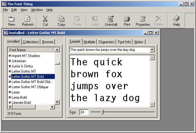
Being a font and freeware freak I downloaded an application
called The Font Thing which gives me a list of installed fonts together
with a preview, and the choice of deleting one or more. After being
somewhat savage in deleting many of the 900 or more fonts I wound up
with 343 installed.
I come from the school of thinking that one sans serif font is much
like another, so having heaps of those is a waste of space and
resources. Ask yourself this: do I use many of my fonts in printed
letters, and is having plenty essential to view documents on screen.
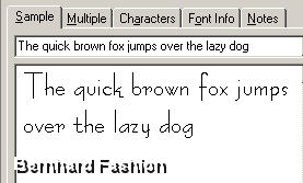
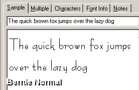
During my first foray I found that I had both Bernhard Fashion and
Bernie Normal installed. Bernhard Fashion is copyright, but Bernie
Normal is freeware.
Guess which was deleted...
Getting down to deleting fonts that in my opinion had no reason to
exist, I selected several that were all uppercase letters. After all -
everyone has a shift and caps lock key!
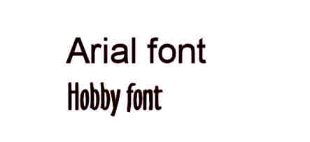
The sans serif fonts were next to be inspected. During this foray I
noticed that I had several monospaced (that means every character is
the same width) sans serif fonts I decided I really only needed one.
I kept the letter gothic, Arial, and Hobby. After all, they are
different, but both sans serif. Not only that, almost everyone has Arial, so will be able to
view hypertext pages without needing to download it.
The ones below deserved to stay because of their name (what better
than Frew in the name) or style (icons as characters).
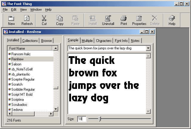
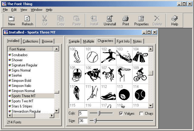
You can propably guess why I kept Renfrew, and Sports Three MT has some
good characters for producing symbols into your printed document. There
are now 214 fonts.
Next stop: save this document to local drive C: - check that pages
are saved with correct names, then collect data for next month's
edition.